Pages

Wednesday, May 09, 2007

One Evening in Gulfport

I know -- it's been a while since I've posted! We've had loads of fun company (my parents passed through and D's parents came last weekend) and some not so fun company (corporate types invaded us several times the past two weeks at work...) I'm way behind on e-mail, too -- so if you've had some big news, and I haven't responded, that's why. There's no way I'll catch up with all the EDM e-mails -- whew -- so I'll just be reading the past three digests or so. I'll try to catch up with everybody's blogs over this week as I can! :-)

So, this is the start of a pastel piece that has been in my head for a few weeks. It is based on a photo of a palm tree shadow against a white building taken one evening when we were in Gulfport (or it may have been in Bay St. Louis?) -- anyway -- southern Mississippi. It's the kind of thing that really catches your eye, but makes a lousy photo -- exactly the kind of thing I'm thinking pastel is probably perfect for.

I didn't think to take a photo until about stage three -- I'd already sketched it out, done a pretty good layer of color, and then gone over it all with acrylic medium and more grit. I don't know why I did that -- I'm overusing that technique, I think!

The next step, after everything had dried, was to add some good color. Here I have the sky blocked in and some nice bright blues... (I think I was also at this point wondering what the heck I was getting myself into???? )


Here I've blocked in even more... This is the best part, because I get to add all kinds of reds and weird stuff in that area behind the trees. It's really a hotel or something totally boring in the photo. In the painting, it doesn't have to be anything but the right value, I hope!


Still work to go, but wow -- have I learned a lot on this one so far! I just have to let it rest for a couple of days - I tend to overwork really quickly with pastel. Pastel artist friends -- I'm having a hard time getting the space behind the trees without having all those obviously jagged-y MARKS. I've followed the rules of using my softest pastels last, but that's messing up my detail. Any suggestions? I'm thinking of using pastel pencil last to tighten it up, but wonder if that isn't going to be too much. I like the almost abstract quality of the left side ...

Wonder what it would look like as a watercolor?

And here's something fun to do when a work looks iffy big, but looks pretty good small -- take a photo of it with your camera phone and use it as your wallpaper. This one works great! ;-)

Posted by Picasa
( "One Evening in Gulfport" work in progress - pastel on sanded multimedia board)

Wednesday, April 25, 2007

Just Waiting On A Friend


One evening, as I was sitting down to dinner, this little chickadee came to the feeder outside the window and perched. He ate only a few bites, and then just sat on the perch, looking around for well over twenty minutes. It reminded me of the Rolling Stones song ... "I'm not waiting on a lady.... I'm just waiting on a friend..."

Anyway, I'm trying to see if this one is finished. Getting the foreground yellow flowers to stand out has been tricky -- too much "fiddling" and they blend into the background. What do you guys think? What and where would it benefit from a dab more work?

My original idea for this, by the way, was to have a very solid gradiated wash background. Yep, solid -- I wanted to empty space to emphasize the feeling of waiting. And I planned on a very neutral and light space, too! Unfortunately, I messed up the wash (experimenting with a pour -- sigh) and then created some SHAPES in the background when I tried to fix it. I was going to abandon the whole thing, but my WC instructor convinced me to carry on along this new direction. (Truthfully, I think she PREFERS this direction to the one I was planning! :-D

OTHER exciting news of the day ...

I got to spend the morning helping to judge and elementary & middle school art show. Our very own Diahn was the Art Fair Chair Person (hereafter known as the AFCP) and she did a fantastic job of organizing and pulling off what had to be a really really tough job. I got to help judge the older grades, so I wasn't forced to avoid bias for Derek's and Josh's work, which was great -- be sure to go see it!

I LEARNED so much from helping with this show! I'm entering my own first juried show in a couple of weeks, and now I know a little tiny bit about what judges look for. I know that it is tiring work. I know that it can be hard. I know that you have to do something that really stands out in the end! Hmmmm... means I need to really think about what I'm entering, doesn't it!

("Just Waiting on a Friend" approx 11" x 21", watercolor on 300# Arches hot press)

Saturday, April 21, 2007

DeMarrais Pastel Workshop

I've just spent the past two days at a wonderful pastel workshop given by Paul DeMarrais -- a FANTASTIC pastel artist, who truly paints like one of the old French Impressionists. What fun. He stresses value value value -- you can use any color as long as it is the correct value. With pastels he was able to demonstrate value lessons and principles easily, much more quickly and with less fuss than with paint. We learned to make our own surface, using aluminum oxide and acrylic medium on multimedia art board -- and this surface is amazing. It holds an incredible amount of pastel and makes working fun. (This little piece, still in progress and done this afternoon after I got home, is on Colorfix -- which is a nice surface, but doesn't measure up to what we were working on with Paul.)
Best of all -- Paul loves what he is doing -- the workshop was pure FUN and felt like playtime.

He makes his own pastels (which he sells) and we were able to go through and get a set if we wanted. They are big and bulky and soft and lay down like buttah .... even Senneliers feel hard next to them. Of course I had to get a set. I'm going to save them for when I get some big sheets of paper made up, though, so I can really lay 'em down!
I've walked away from this workshop inspired, and able to see a potential painting everywhere I turn. If you ever get the chance to meet Paul or see any of his work, be sure to take advantage of the opportunity -- you won't regret it!

Now, I have to take care of my assignment and get my pastels out of their nice little compartments, organize them by value, and let 'em get a little bit messy. Pastels just aren't happy being kept cooped up like that ...
Posted by Picasa

Sunday, April 08, 2007

Wishful Thinking


"Other People's Stuff"
(watercolor on 300# hot pressed Arches)**

From a snapshot taken on our quick trip to Destin to visit the Dear Daughter a couple of months ago. The weather was warm and beautifully sunny, and we got to spend about an hour on the beach. Oh, to be there now! The cold spell that came through our area two days ago (and is expected to last for another couple of days) has destroyed the blossoms on the dogwoods and azaleas, which were both reaching a fantastic peak. Crepe myrtle bushes had begun to put out leaves, which now look like wilted salad that has been slung into the branches. Most of the trees that had begun to leaf out look okay -- I think it was just the very tenderest leaves that were so badly hurt.

Thankfully, I had taken a few photos of the dogwoods the day before the weather turned so cold...


The pink dogwood flowers were intense this year, not at all pale and washed out. Until now, at least.

The white ones, of course, were at that particular stage of perfection that makes EVERYONE break out their cameras and start taking photos!


**Now that I see the watercolor painting on screen, I see that I need to darken some areas in the water, at the base of the central wave. The yellow towel probably needs to have a nice highlight scrubbed out, too. Originally, the far left beach chair was one of those short, "down on the ground" chairs, and was navy blue (based on the photo). I painted it that way, and then realized that the smaller chair just looked like I drew it wrong. I was all for tossing the painting and starting over, but my WC instructor insisted that I scrub out waves and just make the chair larger -- changing the color from dark blue to pink was my idea -- the towel changed from a dull red to yellow. Really, it's amazing what you can do with the right paper. This is just a small painting, and I think I'm going to do it, or something like it, again larger.
By the way, right now I'm working on this, which is not turning out like I'd originally envisioned -- not at all! It may be a do-over, too.

Tuesday, April 03, 2007

Rushing

Spring has arrived in Tennessee in a great rush!

I've also been rushing along -- busy busy busy at work the past couple of weeks, but still painting (just nothing ready to really show.)

It is time for a self report on how I'm doing with my New Year's resolutions, though. Do you realize that the first quarter of the year is now gone?

(1) PROJECT -- 500 Objects. I don't know why 500, it just sounded like a good number. I will be drawing 500 objects over the next year and a half or so.
Gulp. Blush. Sigh. Well, I'll work harder at this one.


(2) I will be working more in pastels.
See small creek study above. See Item #3 below, too! Woo hoo! And for all you shoppers out there -- I bought some new pastels at the amazing April Blowout Sale at Jerry's. Yep. Sometimes it really IS all about the art supplies.


(3) I'd like to take an art workshop sometime this year ... I don't know where or in what...
Friday (yes, THIS week!) afternoon I attend a workshop by Jon Houglam on portrait and figure drawing. AND ... drum roll please ... the weekend of the 20th and 21st of April, a two-day pastel workshop with Paul deMarrais ... an artist whose work I've watched for several years now. I'm VERY excited!

(4) I WILL be hanging art for sale at the gallery at the art center. Period. I'm running out of room here...
I'm planning on entering a couple of paintings into a juried show at the Art Center in May -- we'll see how that one goes! There will also be a student show in July. I need to work on something else, too ... I guess this one is still an EARLY work in progress!

EXTRA -- GALAPAGOS in 5 years --
I've started to teach myself Spanish. Well, it's a start!


How are YOUR plans for the year coming along? I'd love to hear about them!
Posted by Picasa

Thursday, March 15, 2007

Consumed


Okay. Some of you are able to buy delicious looking food and paint it beautifully. I now have a strong suspicion that you actually buy TWO of said delicious and beautiful food items, thus allowing you to eat one and paint the other. Unfortunately, I didn't think that far in advance. This strawberry tall cake portrait is unfinished, while the strawberry tall cake itself is no more. Maybe the painting will get finished sans reference. Maybe I'll just have to go to the bakery and get another! Ha!

So, what would you do with the background? I tend to want to leave it white... Would you indicate a horizontal line, so it feels more like it is on the table, rather than floating in mid air? (It WAS light, but not THAT light!) The plate and fork need to be finished, and some texture needs to be added to the cake layers -- what do you think about finishing it with colored pencil, or would I then need to go over the whole thing with CP layers? (note -- it is done with watercolor on 300# hot pressed Arches, so it is just smooth enough for colored pencil touches...)

I think I'm going to do more of this kind of thing. It was very relaxing. You might even say it was fulfilling...
Posted by Picasa

Saturday, March 10, 2007

Slap Dash Bayou


Jambalaya and a crawfish pie...
Slap dashing wet paint on 300 # COLD press paper -- a new surface for me. I like the weight, and that I don't have to stretch it -- I like having a bit more control than on the hot press -- I like it so much that I went and bought 2 more pieces of the stuff as soon as I finished this little painting!


Big news of the day -- I signed up for a 4 hour portrait and figure drawing class given by a most excellent oil painter, Jon Houglam, which will take place the first week of April. Nothing like a different perspective to give a little kick in the seat of the pants, or so I've been told!

Next weekend is the world wide sketch crawl, and Diahn and I have plans to meet up for that -- hopefully we'll have awesome weather! If you don't hear from me before then, well, I'm probably painting beach scenes on my new watercolor paper...

And if YOU are in the Knoxville area, and are interested in sketchcrawl day, just let us know!

(The technical bit: Watercolor on Arches 300# cold pressed paper -- painted area approx 13"x9", and the colors are a bit richer in real life. The boat looks much more anchored in the real thing -- it looks a bit airborn here in the photo!)

Posted by Picasa

Wednesday, March 07, 2007

Skooshing Up a Storm


... honestly ... I have no idea what I'm doing with acrylics, but this was kind of fun anyway. I mixed all those greys all by myself. And one would THINK that waves would be kind of easy -- just skooshing them on there, but obviously they are not. Still, the skooshing bit was nearly as fun as mixing all those greys. In the future the stormy seas can be left to the the experts!

More about ruts later -- tonight I'm playing!


(The technical bits: Okaloosa Island fishing pier, Ft. Walton Beach Florida -- from a photo taken on a very stormy morning in January. Painted with Golden Acrylics on an actual 16" x 20" CANVAS. Yep. A real canvas. Colors used to make those lover-ly stormy greys were Winsor Blue Red Shade, Cobalt Teal, A Tiny Bit of Hansa Yellow Medium, Much More Nickel Azo Yellow, and Naphthol Red Light -- all with a Dab of Titanium White. I could have just done canvases of streaks of greys, it was so much fun ... )

Posted by Picasa

Thursday, March 01, 2007

How to Get Into a Rut (And Back Out Again) part 2

(Feelin' Loon-ey -- colored pencil on color fix paper)

If I were a flower, I'd be a biennial.

Really. It seems like every two years or so, dissatisfaction sets in and I become very self critical. In the process, I will often quit whatever "arty" mode I'm in, not do ANYTHING for quite a while, then slowly start back.

TWO years are here now.

The Everyday Matters Group has been discussing "slumps" for the past few weeks, and it seems that a lot of people are experiencing the same problem. On the advice of several people, I bought Walking In This World by Julia Cameron (of Artist's Way fame) and am reading it. I've revolted and am NOT doing morning pages -- tried them before and they just don't work for me, but the book itself is a really good read. I've gotten loads of other helpful advice, and it REALLY IS helpful -- work smaller (like the example above, which is maybe 4"x6", or a tad smaller), change up mediums for a bit, try totally different subject matters, etc.

I'm trying all of them, but the best, most straightforward piece of advice may have come from Casey, who wrote:

"... As far as I can tell, there's no miracle cure except to keep slogging away -- one day it's over, and your work has improved all at once. If you stop working the game's over, at least for a while."

I think she's onto something BIG there. Maybe she should write a book, and title it "Slogging Away in This World" ...

:-) Thanks Casey!

And then there's the whole synchronicity thing ...

Tuesday, February 27, 2007

How to Get Into a Rut (And Back Out Again) part 1

Girl Studying -- pen drawing on legal pad at the coffee shop in February.


So, on the last post I promised to discuss my recent artistic slump and what I planned to do about it. This will probably take several posts. Be Warned...

How it all started -- or at least reached it's deepest low --

Sometime last year, Diahn and I decided that we really should at least TRY entering some work into shows, galleries, etc. We had one major hurdle, though -- no Artist's Statements! Yep. That was our biggest problem at the time. Everybody wants an artist's statement to accompany any work that is submitted. Sounds easy, doesn't it!?

The research began.

We read about how to phrase the artist's statement, happy with the advice that the wording should not be too "artsy" or esoteric, but short, simple, and direct. Later, of course, we were mightily confused when we read actual examples of artist's statements. I'm pretty sure now that we just got a hold of a bad batch of the things to begin with, but quite frankly, folks, some of these statements were just weird. Intimidatingly weird. They were about resolving social issues, political revolt, and dangerous furniture. I kid you not. And these people would never kid you -- they are some Serious Artists.

Diahn finally got hers done -- it is a beautifully crafted straightforward piece of writing. Nothing in it makes me worry that I'm not thinking hard enough about how horrible the world is or how I'm just too blind to see the wretched (and dangerous) inter-connectedness between a tulip dying in a vase, genocide in Africa, and my perilous bedcovers. HER artist's statement is happy. It describes her work. IT works. I would have just plagiarized the darned thing, but we would probably be submitting pieces to the same places, so that simply wouldn't do. For the first time I wished she lived in California -- then maybe I could get away with it ...

After six weeks of agonizing over writing my artist's statement, it became apparent that my lack of direction in this area had colored the rest of my life. Everything I painted or drew, everything I had ever painted or drawn, everything that I even considered painting or drawing seemed trite ... petty ... silly ... goofy ... lame ...

At our mid-February coffee meet-up I told Diahn, "I can't write an artist's statement because I AM NOT AN ARTIST." I meant it. Really. It was making me feel like THAT.

Smart girl that she is -- good friend that she is -- Diahn reached over, pulled the legal pad out of my hands, and said, "STOP."

She officially absolved me from writing an Artist's Statement.

I immediately felt better, and I feel better still.

So, here's my Artist's Statement -- not refined and ready for a gallery application, but it IS the truth:

"If I see something that makes me happy -- I chase it down and I draw it.

"When I see something that makes me smile, or makes me catch my breath for a second -- I sit down and paint it.

"Usually I paint the places, people and things that I know.

"Sometimes I paint the places, people and things that I wished I knew better.

"I do it because it's fun, it makes me happy, and BECAUSE I WANT TO.

"Take it or leave it."

Love,

Linda ;-)

Posted by Picasa

Friday, February 16, 2007

Second Blogiversary

Today is the second anniversary of this blog. Little did I know, when I first started it, how much fun it would turn out to be, and what a wonderful way it was to interact with people of like mind.
Thanks to all of you who visit regularly, despite my erratic posting pattern!
Thanks to all of you who visit only occasionally!
And it this is your first visit, thanks to you, too, and I hope you come back!
Later on, when I get my thoughts together, I plan to discuss my "2-year slump", and how comments from the group at EDM along with conversations with Casey and Diahn have helped me recognize a pattern that I hope to break. There's not time now ... the weekend is upon us! Let's all go do something fun!

Sunday, February 11, 2007

Venice


I finally finished the Queen Anne's Lace painting (my WC teacher has it to photograph, so I can't post the end result yet) and I just couldn't deal with any more green. BADLY needing some color, and having some photos with me from Bonny's trip to Italy, I decided to "visit Venice." The whole painting was done really quickly, without any preliminary drawing, using a 1" flat wash brush for all but the final details, which I did with a #16 round. Despite the mudpuddle in the middle, I love making this particular type of mess. Maybe I'll do it again with some proper perspective drawing and better detail. Meanwhile, I had a really good time just splashing around!

(Actually, now that I see it on the monitor, I think I may need to do some tweaking. It isn't for framing, though -- just for fun, so I may leave it alone. Who knows! Who cares! :-)

I've been otherwise quite busy lately, but am nearly caught up and back to normal. We have a vacation in the works, which may mean for some interesting drawing / photography opportunities. We'll see!

Tuesday, January 23, 2007

Silver and Lace

(Pastel pencil on Mi Tientes paper)
Object 10 -- the top of a silver coffee service from an estate sale.
Seems like I just want to draw this one at about 300% of it's actual size!

I've been up to my elbows in a watercolor of Queen Anne's Lace (the flower -- not a fabric!) that I've done and re-done several times.
This one was started in WC class two Saturdays ago and I worked on it again this past weekend. WHAT A MESS! No middle values at all -- any that you see are the result of heavy scrubbing out. However, I got a much better feel for what I was aiming for and so, when I got home Saturday evening, started another version ...


This is the newest version in progress -- well, a portion of it (it was too big for the scanner). I totally changed the colors, and am trying to keep some middle values. I also made liberal and frequent use of masking fluid. Now, can I nurture this one on all the way to the end? There's still a lot of work to be done on it, so if not, it will just get done again ... and again ... and again ...
Posted by Picasa

Monday, January 15, 2007

Questions and Caveats

Special thanks to R.Chunn, whose still life paintings are one of the special inspirations for the 500 Object Project.

Laura and Mereth both asked if the bottles in the earlier post counted as one object or three, in my quest for 500 objects. (Did I REALLY say FIVE HUNDRED?) I'd already worked out the "rules" for this very event ...

The bottles, being three entirely different types, count as three separate objects (#7, #8, and #9), even though I obviously drew them at the same time.
(By the way, I'll also clarify that I never promised the drawings would be GOOD drawings, either; this was one of those times that I made myself sit down and draw, with gritted teeth and some unrepeatable muttering!)

The candies, however, are identical objects, so they only count as one, even though there are three of them.

The final caveat, though, is that when an object gets re-drawn (as the Buddha surely will be), it STILL only gets to count as one. (!!!WHAT!!!) Yep. Not being at all hung up on any idea that it will only take a year to draw all 500, there are a lot of things that I'll probably draw over and over again. The good thing about this plan is that if I then work the objects all into an actual still life painting, I get to name it something really artsy and obscure, like "Objects 3, 18, and 32 with White Linen" -- which also solves the whole "what the heck do you name this painting" dilemma. (Personally I thought the idea was brilliant until just now, when I'm suddenly feeling a bit iffy ...)

Did I miss anything? And what was I thinking?!?
:-D

Sunday, January 14, 2007

This Weeks Drawings

(Sorry if any of you have had problems with this post earlier! Let's try it again now, shall we ... and thanks to Janie and Annie for pointing out the problems!)

Continuing in the 500 Objects Theme:

... a seashell ...
... and three little bottles.

And Little Watercolor Cards

The spring feeling in the air today inspired me to do these quick notecards based on flower photos from last April. Fast and loose, and very relaxing to do.
(Tulip magnolia blossom and White tulips on an white cloth -- watercolor on Canson WC greeting cards.)
Posted by Picasa

Holiday Inn Sunspree


Even though it was a chilly, overcast, and wintery weekend, I totally forgot to tell about our wonderful stay last weekend in Ft. Walton Beach, Florida. We stayed at the Holiday Inn Sunspree, and the staff was just fantastic. We had a hard time finding the hotel (since we were busy chattering and not watching), and when we called for better directions, one of the staff members actually came out to the end of the drive to cheerfully wave us in. All the staff were just as cheerful, and the place was clean and well maintained. I was also impressed at how the dunes behind the hotel were the only ones on this section of beach that had been built back up to a good height and well planted to reduce erosion.
If you are planning an off-season trip to the area, I recommend giving this place a try!

Saturday, January 13, 2007

Smirking Buddha


Object #5 -- a Buddha statue / votive candle holder (sans candle). Maybe it was the way I was sitting crooked in the chair, but I ended up giving him a very un-Buddah-like smirk, which I have only just noticed, several days later. Maybe he's in transition to being the happy buddha. Who knows?

This was a Christmas gift from my friend Renee -- actually my husband ended up with it when we did a white elephant Christmas. We had the best time, and I was really glad we ended up with this! So -- it also gets to count as EDM challenge #98 (?) -- "draw a gift you received."

Meanwhile -- I think I'm going to have to try a re-draw, but will do it in a different medium!

(The technical bit -- watercolor and ink in Moleskine)
Posted by Picasa

Monday, January 08, 2007

Tassle and Candy


Object 3: An "elephant tassle" that I got this weekend on clearance while in Florida visiting my wonderful daughter. (It was on sale for $3.95 after tax -- I just love it.)
Object 4: (?) Strawberry candies scattered on the table.
(The technical bit -- done with 005 Micron and colored 01 Staedtler pens in Moleskine.)

Artichoke

Just playing around with acrylics. It's harder than it looks!

Wednesday, January 03, 2007

Seashell


Object Number Two. A grey sea shell with an orange interior -- perched upon a cigar box.
(Technical bit -- Staedtler ink in Moleskine. And the scan made the orange look much darker than in real life.)

Rocking Horse


Object One -- the first of, oh dear, five hundred! :-D

Monday, January 01, 2007

2007 New Year Art Plan


Diahn and I met today at Panera Bread to sketch and catch up and talk about our Art Plans for 2007. We have decided that it's time to get serious -- but still have fun!

The first thing I had to do was look over my last year plan and see JUST WHAT WENT WRONG...

Expecting that NONE of my goals would have been met, (because I'll confess that I haven't reviewed these goals in some time -- Number One Mistake) I was really pleased to see that I'd come a long way on goal #1 (Improve my watercolor technique -- kind of vague, but hey...), was at 90% on goal #5 (Finish the paintings that I start), and had done GREAT on goal #6 (get out there and draw in public -- THANKS Diahn!)

The others, though -- of doing monthly color studies (de-railed in the second month), draw all the plants in my yard, and do one detailed botanical study a month, just didn't happen. They just DIDN'T.


Now, in all fairness, I was sidelined in early February by some health issues that impacted my day to day life for several months, and I can assign part of the blame there, BUT ... really, was that enough to totally de-rail all those good intentions? Nah. It wasn't.

The problem was that the goals I set didn't have a stated purpose, other than I felt like I had to have an art plan. That's okay, but that's where I should have revised them upon review -- um, review which did not happen. Duh.

The color study plan -- great idea, and would have been one for follow through, but my watercolor teacher had different ideas about how to study color, and so, since I'm paying her and she's the teacher, I went with her plan. I still need to work on color studies -- FOR SURE -- but I just don't think I can devote extended uninterrupted time to a particular color. That's just not me. However, this year will be spent on extensive color charts, not just in watercolor, either!

The botanicals and yard drawings -- I just felt like I had to draw something, and that was true. I love botanicals. But, upon reflection, the main reason I chose botanicals was because I didn't know how to compose a complete painting and it felt like a safe bet ... an easy out. It took me nearly a year to realize that.

So. What's up for 2007? I've been thinking about it since November, and here's the beginnings of the plan.

(1) PROJECT -- 500 Objects. I don't know why 500, it just sounded like a good number. I will be drawing 500 objects over the next year and a half or so. I don't know what they will be -- just stuff around the house that appeals to me. There are plenty of bottles and vases and boxes and tassles and THINGS -- enough that no matter what the weather or the amount of time I have, I will be able to draw something. The medium will be pencil, pen, watercolor, pastel, whatever appeals to me. I will also be working these objects into still lifes (because I just find that I really like still life paintings -- who knows why -- very old fashioned, but I do!) PURPOSE of this goal -- to improve my drawing, painting, and seeing -- to improve my concept of form and arrangement and composition -- because drawing is the basis of all painting. It is something that MUST be done -- not just should or ought to -- MUST.

(2) I will be working more in pastels. It is kind of funny, but I had a pastel piece that I was playing on the other day, and my husband said, "I like that!" I answered, "I know -- I'm actually kind of good with pastel, that's why I never use it." It was meant to be a joke, but it turned out to be one of those jokes that had a sad bit of truth to it. I've gotten so accustomed to the idea that art MUST be a challenge, that as soon as I begin to feel comfortable with a medium, I change to something else. I'll never master anything if I keep doing that. So, I'll continue working in watercolor -- nothing looks like it! -- but also will be working in pastel -- because nothing looks like it, either!

(3) I'd like to take an art workshop sometime this year ... I don't know where or in what, but something as a little treat.

(4) I WILL be hanging art for sale at the gallery at the art center. Period. I'm running out of room here...

ACCOUNTABILITY -- Diahn and I decided that we are going to review our 2007 goals with each other on the 17th of every month. That's accountability, right!? So, hopefully in 2 1/2 weeks there will be a more detailed yet less wordy report!

AND -- by the way -- we set a 5 year goal, too. Does this photo give any kind of hint?


(shhhhh.... we haven't told the guys yet)

Saturday, December 30, 2006

The Strangest Pencil


I hope everyone had a wonderful holiday! We have been without Internet for a bit, due to a bad cable modem, and are finally getting back up and running. Now I'm busy cleaning up all the holiday mess -- there's a Christmas tree to be hauled out back (when I can finally let it go -- as it gets older it smells more and more wonderful!) and furniture to be returned to it's regular arrangement. Art supplies can be pulled back out and painting resumed. Of course, there is a trip to Florida in the making, so some delays are inevitable.

All the gifts I received were delightful -- just what I wanted! Exercise clothing and gear, computer gadgets, music, and art supplies (or the cash to purchase them!) I just have to show you all the most unusual gift of the year, though! This is a graphite sculpture -- or "graphite object" as you may prefer -- designed by Agelio Batle in San Francisco. It was from my sister in Phoenix, selected on the advice of my thoughtful niece. It can actually be used to write or draw; I may do ONE drawing of a seahorse (from a photo from the Aquarium) with this, but then it will be display only! Pretty neat, huh?

You can see more of this type of graphite sculpture here.

And the end of the year is here -- which means it is time to review last year's plan (and how it did NOT go off as planned!) and make a plan for 2007. I've been mulling a few things over in my head for a few weeks now, and am nearly ready to finalize those goals ... we shall see.

Tuesday, December 05, 2006

Happy Holidays!


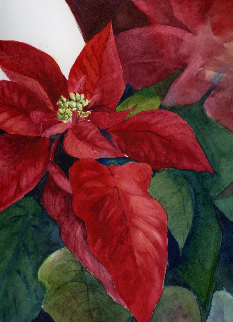
Saturday -- the last watercolor class of the year. I went in with nothing in mind, saw a poinsettia on a table, and, remembering that this week's Everyday Matters challenge was to do a holiday card, vowed to paint the entire thing in one sitting. Well, I didn't quite make it, and now the feeling is gone ... so here's what's left. What to do with that upper right corner, and exactly what was I thinking on the upper left??? If this gets finished it will be next year's Christmas card*.

Of course, we all know what the month of December means, don't we? This is probably the last serious post of the year. Christmas is irresistibly fun, in my book!

*This sketch from last December is what I used for a card this year, in a limited quantity. I ordered them through Qoop (via Flickr) -- and they really turned out nicely.

Saturday, November 18, 2006

EDM Apple


This is probably showing up larger than life! It is actually about 2 1/2" x 2 1/2". I was playing around with colored pencils on Colorfix paper (a sanded pastel paper) after seeing Maggie Stiefvater's amazing work in this medium. The whole drawing took 5 minutes or less -- the paper just pulled the color right out of the pencil! It was really like learning colored pencil all over again -- the paper made it a brand new medium! I think I'll grid off this whole sheet and work on all those EDM challenges that I'm behind on...

Note -- I got the paper in a pack from Jerry's Artarama. A full sheet runs about $7 or $8 -- BUT they had warm or cool color sampler packs in quarter sheets for $13!! It was a fun way to try something new. It wouldn't work at all for a sketchbook or journal -- the paper is thick and sanded, but it is a fun surface for colored pencil. I may have to grid off several sheets and do a sheet of veggies ... a sheet of fruits ... a sheet of flowers ... a sheet of leaves ... the list could go on and on! ;-)

And an extra big Happy Blog Birthday to Lin who has drawn every single day for a year. I bow at your feet, oh dedicated one! You are a joy and an inspiration! :-D

Wednesday, November 15, 2006

Peggy's Cove


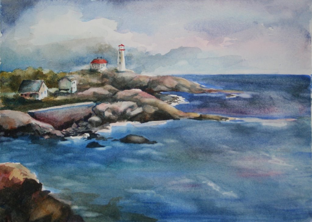
Started as a "sketch" in watercolor class while I waited for paper to soak, but I've become rather fond of this. Mostly I'm fond of the idea of going to this gorgeous place -- Peggy's Cove in Nova Scotia. Anybody been there?

(There's still work to do on the water ... and it photographed terribly!)

Saturday, November 04, 2006

Flesh


Still working on planning a painting of people on a beach, when I realized I'd NEVER successfully painted skin with watercolor. So, I found this photo of a boy in the sun and gave it a try. Sadly, this is the best I've ever done with skin tones (the improvement is good -- but where I'm still at is NOT!) Portraits themselves are not the problem -- it is rendering the smooth transitions and varieties of colors in skin that has me stumped.

I tend to dislike being a formula paint-mixer, but if anyone has suggestions for good skin tone mixes, please share! Meanwhile I'll keep working at it.

What I used -- base was a thiiiin mix of raw sienna, cad red, and a little cobalt. Then thin glazes of burnt sienna, some cad red, some cobalt, a quick streak or two of viridian and cerulean (not mixed), a little new gamboge or winsor yellow (can't remember which) to lighten it up in the sunny spots, I think a little indian red, and maybe even some winsor violet in some of the really dark darks. I did it all on 300# hot pressed Arches paper -- expensive paper to be practicing on, but it is what I THINK I'm going to be using. I started out soaking the paper for a LONG time per my WC teacher's instructions, since the very saturated paper helps the colors mingle better.

I'm not looking for critiques of the portrait itself (yep, there are flaws in the upper lip -- big time!) or the background (just a quickie to get it finished) -- I'm looking for ways to make that skin look really sun struck, with a nice deep summer glow in the shadows, and bright highlights, yet still smooth. Maybe I'm looking for too much! :-D PLEASE -- you wonderful portrait painters out there -- share your secrets! Posted by Picasa