

 In a recent discussion on the "Art Workbooks" list, I mentioned my watercolor notebook. Karen asked that I post some of the pages -- did she realize how terribly boring it would be? The first page of the notebook is a diagram of the palette used in my watercolor class, with each color listed and numbered.
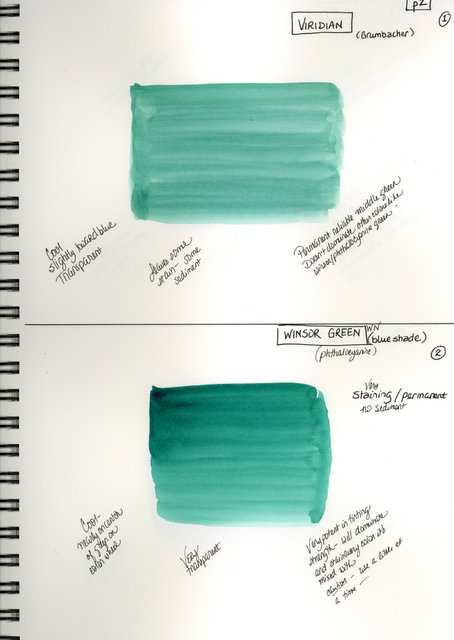
The next part of the notebook (which is a 9" x 12" Canson All Media book) has each page divided in half, with each half devoted to a color on the palette. There, I painted a good sized square of the color, never minding that I didn't get a good even wash, obviously! I now have a place to put notes about the color -- notes that I get from class, from various books, from comments on the mailing lists I belong to, or from my own experience. I'm very interested in how the pigment actually acts -- is it transparent or opaque? is it granulating? is it lifting or staining, and how staining is it? how well does it mix with other colors -- does it dominate or get lost in the mix? This is the kind of information that I'm trying to learn and know so completely that my color choices are logical and (hopefully!) intelligent, and based on more than it just being a "pretty color".

The next section of the workbook is a growing number of color charts. So far there are green charts, brown charts, charts of darks and lights, shadow color charts, and so on. All these charts are based on assignments given by my watercolor instructor, who will give us a chart that she has done, and let us work on "matching" her colors at home. I've found that it's one thing to mix a green, it's quite another to exactly MATCH somebody's green. This has been really good practice for me -- the next step, though, will be to match up the how and why you use these mixes, based on the knowledge I'm learning about each individual pigment.
You'll notice on this chart that I really can't ever play completely by the rules. I had to go back on a bunch of the colors and play around with how well they lifted. It's like a compulsion!
Anticipating that there will be lots more charts and other exercises, color mixing notes, etc., I've left plenty of pages blank before I started the next section...
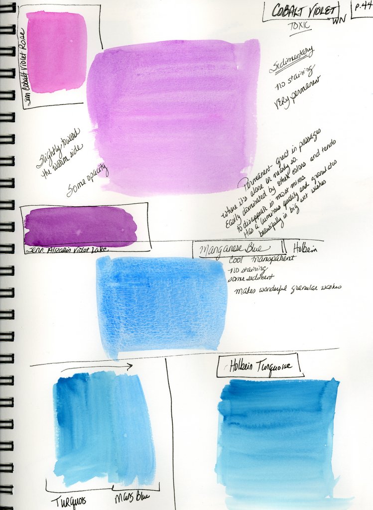
I started this section at the back of the book and am working my way forward with it, which lets me be sure of plenty of blank pages to work on in the center of the book. This section is made up of all my other colors -- what I call my "illegal palette" (since they are not used in my class.) I still collect notes about them, and use them on and off ... several of them will become permanent additions to my palette once the class is over, I'm sure.
This cobalt violet is one of those colors that I never used to appreciate, and now think it would be fun to use in some background mixes for landscapes.
The manganese blue is an old tube of Holbein -- the real thing, not the new "hue", and is therefore precious. Since I've been learning about the behavior of the pigments, I really appreciate its very granular quality. Isn't that something?
Some of the pages are even less organized than this one, and there are plenty of notes referring to another color on another page (for example, Winsor Red on page 6 has a note referring it to Winsor Red Deep on page 46, and so on.) I have this notebook open when I paint now, and can flip around in it as I go, reading notes, as well as adding to my notes. I've only used the front side of each page, leaving myself the back of each page for room to grow.
And that, Karen my dear, is how I use my watercolor workbook! If anyone has any ideas about how to make it an even more useful tool, I would LOVE to hear them!
12 comments:
Linda, I think that is absolutely wonderful. What an excellent tool you have created!
I believe that your addition of the "lifting" test is absolutely inspired.
I see that you did it in an all media book ... do you feel that it would be any different had you done it on watercolor paper, or do you think that the weight of the paper and its properties were adequate. I am starting to turn my aquabee superdeluxe sketchbook into a watercolor resource workbook and I was even wondering if the 90 lb. paper would be heavy enough. Maybe the type of paper doesn't matter so much. I LOVE the idea of leaving space around the edge for adding other notes. I'm going to post this response to the yahoogroup also ...
Thank you again for taking the time to scan and post these!
WHAT a fabulous book of notes you have -- and I'll bet you'll be so glad!! GREAT reference -- and what's best to me, Linda .. it's so neatly done! I tend to make my notes scattered all over the place, then get mad at myself for being sloppy! LOVE YOURS!
Karen -- you sure are quick! The all media book is 90 lb watercolor paper, which is heavy enough for this kind of thing. What I like about the Canson books, is that they are spiral bound with a hard cover ... if I know I'm going to be working really wet, I just use drafting tape to tape my paper down to the back cover, which keeps it from buckling quite so much.
This is great. My teacher suggested that we examine the lifting properties of the colours too -- that's one of the most useful things I learned from my class. What do you mean by shadow colours exactly? Colours shadowed by their complements, or what?
Linda, I really like the way you have set your book up. I just started a book and am just using the back section of the book to put a sample of my colors. I have a drawer full and want to choose which ones I want to put on my pallette. It really is easier to use colors you really know. Thanks for sharing. Jean
Linda, I really think your color notebook is great- I don't think there are any hard fast rules. In my color study book I find the studies can be all over the place- with no apparent consistency but as I go back they really are important because I forget so easily.
btw- I really love your sketches
Oh my goodness. I'm such a lazy painter.
This is great, Linda - thanks for posting them! I have so much to learn...
Precious work
hfm
http://tcores.blogspot.com
Nancy -- actually, the "shadow chart" is the one that I did all the lifting practice on! These are mixes that she says can be used to glaze over an area for shadows. Seemed like an unusual way to look at things -- almost a little "cookbook" to me, but then I realized that I already tended to do that with French Ultramarine and Burnt Siena, so it made sense to have other such mixes that could be almost "neutral tones." I even used the cerulean and rose madder mix the other day with pretty good results ... all in all, when you take a class you are going to learn some things that you may or may not use later on, if you know what I mean!
Oh my gosh Linda, how perfect!!!!! I am taking a watercolor class right now and am going to try and do the same thing (key word here is try). I am finding my notes all over.
I will sure be back to look more.
Wonderful job!!
Boring? How could you think this would be boring. It's facinating even though I don't paint and even though some very nice on line blogging buddy sent me some paint and paper:D
Fantastic little book. I feel inspired. I really must do something similar. All these years I've just relied on instinct (which often gets it wrong).
Post a Comment