
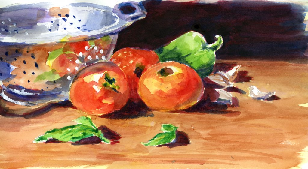
 A very quick (and sloppy!) value study for a painting that I'm going to be working on (photo from Wet Canvas) -- which I will also use as my submission for the Everyday Matters Challenge to "draw something metallic."
Sidenote -- this type of color value study is not an "assignment" from my watercolor teacher -- I wonder why not? Is it a bad idea, or what one really should do?
Mostly, I've been working on color charts, learning to mix greens (so I can quit using the infamous and fugitive sap green -- even though I love it dearly) and browns (which have been a thorn in my side for some time now!)

 And I promise ... I'll be better about posting now that I'm getting "back in the groove!"
25 comments:
Wow that is so great! The colors are so brilliant!
This is simply beautiful. I love the quickness and lushness of it. The reflections of the tomatoes in the colander are stunning. John Singer Sargent would see you as a kindred soul, if he were still around to see.
OH MY GOSH!!! IT'S INCREDIBLE, LINDA!! LOVE LOVE LOVE the colors, the shiny surface, the reflections!! And those greens -- yummy!!!! FANTASTIC! Oh to watercolor as vibrantly! And to do it FAST!!! It's not nice to blow off my socks when it's so cold!
PS -- I LOVE THE BROWNs even more than the greens!
It is very pretty. I am fascinated by the reflective quality of the colander...you make it all seem so easy!
WOW, this is awesome! Those reflections look great!
Call me strange but I love colour exercises and their results. Please post some in full!
Oh, to do such beautiful work as "just a value study". Can't wait to see the fully developed painting!
I'm glad to hear you're getting over your paralysis - I hope the class is going well, now! Missed ya!
Oh, thank you all! It is nice to have people rooting for you when you feel like you're going to suffer the big TKO in the next round! You all made my day, even Laura who must be referring to some deep psychological trouble and pathological impatience that Sargent experienced, and not referencing art itself ... (don't we all WISH we had a smidge of Sargent's talent in us! Laura, you couldn't have picked a better compliment!) I gotta share, though, that the reflections in the colander WERE easy -- I just splashed them on there and was shocked. I think we might just give reflections more fear than they really deserve. It was eye opening! :-)
Wow, these colors are awesome and vibrant. Love it. Keep them coming.
Well, this is not what I expected to see as I read your comments (quick and sloppy) and waited for the picture to load! Wow! Simply wonderful!
Wow...beautiful! love the reflections!
I LOVE the reflection you created. This is a lovely piece. Well done. Clear beautiful colours and it looks confident and purposeful. Congrats!
Excellent metallic study! I like the idea of doing a green and brown study chart. Sap green is one of those colors that is difficult to give up--it's just so "mossy" "jungley"???? I've been using more gray greens lately, adding red to my pthalo and viridian. Greens are tough. :)
A great "value study". It's wonderful to be able to capture such vibrance with a few swashes of color.
That is so beautiful and the shiny surface and reflections. Just....well beautiful! And yes please post more drawings.
Good post.
hfm
http://tcores.blogspot.com
I love this painting, sketch...you did such a great job on the reflections. Metallic is definitely a challenge. I think you are on your way to a great painting!
Beautiful watercolor paintings!
This is great! Everything about this is wonderful. The composition, & the dark background really makes it pop.
great work! And hard to capture, that metal. The colors are perfect.
You're back! You're creating BeaUty! I'm sOo happy.
I paid my dues aswell. I spent about a2 weeks doing color charts in oil. But it sure paid off. I leraned a lot and still use them on a regular basis to guide me in mixxing paint properly. I think this is one of your best pieces.
Utterly beautiful!
I think if you love Sap green you should use it. I consistently see other artists using Alizarin Crimson all of the time and it is the most notorious fugitive color around. I think you should feel comfortable with what you use.
Post a Comment