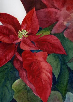
Saturday -- the last watercolor class of the year. I went in with nothing in mind, saw a poinsettia on a table, and, remembering that this week's Everyday Matters challenge was to do a holiday card, vowed to paint the entire thing in one sitting. Well, I didn't quite make it, and now the feeling is gone ... so here's what's left. What to do with that upper right corner, and exactly what was I thinking on the upper left??? If this gets finished it will be next year's Christmas card*.
Of course, we all know what the month of December means, don't we? This is probably the last serious post of the year. Christmas is irresistibly fun, in my book!
*This sketch from last December is what I used for a card this year, in a limited quantity. I ordered them through Qoop (via Flickr) -- and they really turned out nicely.


18 comments:
Good grief, it's GORGEOUS!!! I first thought it was a photo and you wanted that corner blurry.
Gorgeous colors!!
It is so bright and cheerful! The corner does look rather interesting and not at all odd to me. I kind of like it that way!
Hope your holidays are full of good cheer. Tis the busy season of the year, but don't be a stranger around my parts!
wow is this awsome...i was not sure it was a picture...but its a watercolor...I am going to have to go buy one and try painting it ....AWESOME job...makes mine look shabby:>
Very beautiful!
Linda, I think you've got a very good thing going here. Beautiful job on the main flower.
To answer your question of how to handle those other bits, I'd add more leaves in green in the upper left, and push the flower on the right back by glazing some blues over it, maybe. But define a little bit of its center, too, but softly. You've got your star, you just need to let the supporting cast do their jobs.
I also did a double take at first - it seemed so like a photograph! What a beautiful job.
Oh lovely - L love the dark red you've managed to achieve and I agree with Karen - you could possibly fill the top left with green leaf. Well done!
Linda,
The pointsettia is just gorgeous! I also clicked on last year's card and immediately remembered how much I loved it when I saw it last year. Your WC skills are an inspiration to me!
wow! this is gorgeous and your last years card was fantastic too.
Beautiful poinsettias!!! What a good job you've done with them!--Carol
Glorious!! Do what Karen said - or just make a card with the main flower cropped in all it's fabulousness!! I remember Santa from last year too - but I think the hippo needs to be a Christmas card, personally - at least one to me!!!
This is so beautiful. I'm curious if you touched up with digital? It looks so real...
Honey, I'm stumped, too. Hey! I have an idea---buy a poinsettia of your own and use it as your model for completing the composition! Having a plant in front of you will give you the info you need and you can figure out how to work the new forms into this piece. I betcha. Let us know how it turns out!
Thank you all so much! I've been given some very good ideas for how to finish this -- maybe it will happen this weekend! Hmmm... maybe a hippo card is a good idea! And, Marilyn, I didn't do any digital touch up, but you've given me the idea of playing around with digital for the questionable corners -- that way I'll have a better idea of exactly where to go! :-)
This is exquisite. I love the rich velevety textural look of the red leaves. I like the way there's a little place for the eye to rest or breathe in the corner. It doesn't make me get stuck there or keep me from looking back at the subject. If you greyed it a little so that it didn't contrast too much, you could leave it there as a little opening in the picture.
Wow, absolutely wonderful! I agree, a touch of green in the corner would work well. Lovely details!
Second thoughts - I like that left corner as it is! It does give the 'star' centre stage.
Really good Linda!
Post a Comment